
The theme is week is COLOR.

What about color? One mistake I often make is dashing out in the middle of a project empty handed, only to stand in the fabric store and stare at 50 shade of blue, thinking "darn! I swear I'd remember which one I needed!" Thread, fabric... I do it all the time. I don't want to haul around what I'm working on, and I don't always have a sample to take. So, Tip #1 is to take a sample to the store. Color-matching Plan B would be to use these fabulous and free samples.
 |
| paint sample cards from the hardware store |
I have a whole schwack of these in a big ziploc bag. It really comes in handy. So often I think I can pick out the shade of grey or green from memory... but as my kids would say, "FAIL". These color sample cards are really great when you want to audition a new color into the mix you already have. Plus, the backs are white so you can jot little notes on the back if you need.
My last tip is a repeat from one of my earliest tips. I still use it a lot. It's the selvedges. If you are trying to coordinate with a particular print, just take a look at the selvedge. It contains a dot of every ink used in the fabric itself.

Coincidentally, the black circle it's in will tell you if the color was printed properly or not according to the design. I'm always amazed at what colors I will notice I didn't notice at first. Take this fabric for example:
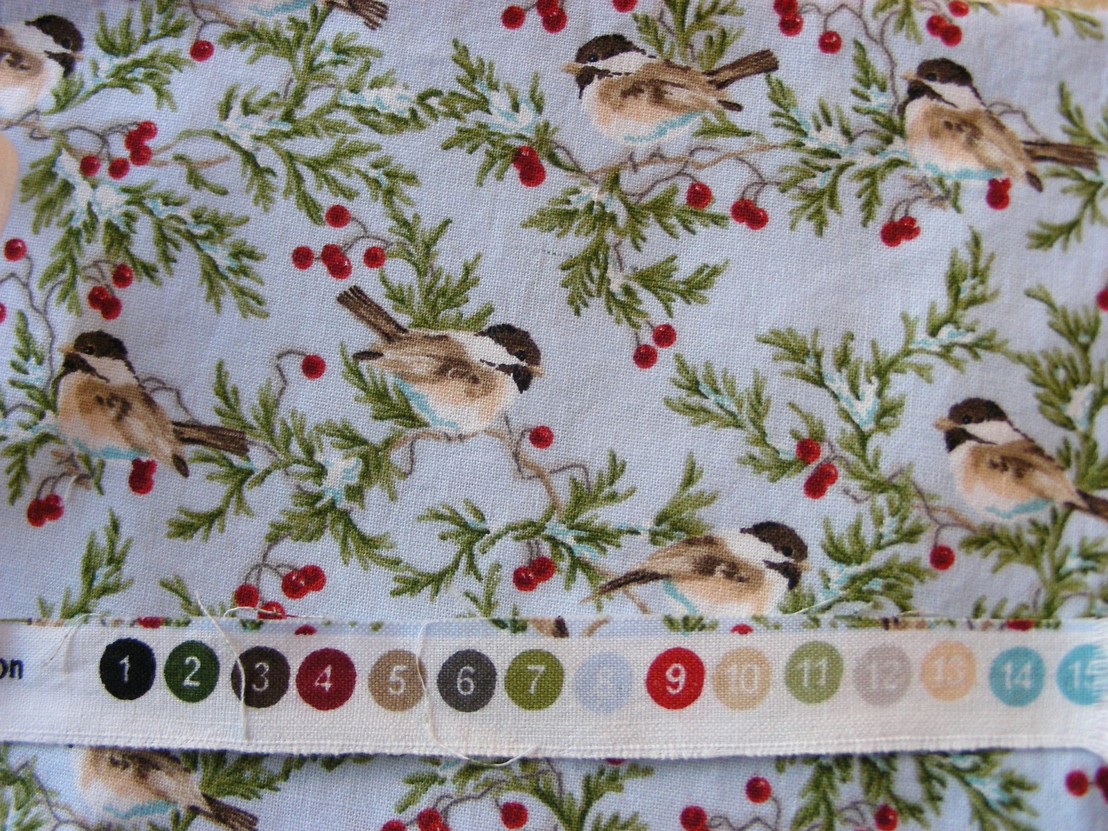
And now look through the color dots. There are likely to be some good ones you may not have seen right away.
I also have 2 books from our guild library that deal specifically with color. They are fantastic, and fairly new. One is "Quiltmaker's Color Workshop" by Weeks Ringle and Bill Kerr. WOW. I would have photographed every page to show you, but that's just wrong. It is a fabulous book. The second book I picked up is this one which is equally as good.
 |
| a really great read for the summer |
Okay, now it's your turn. You have to leave a tip. It's like take a penny, leave a penny. Anything goes, as long as it is related to sewing and color.

Thanks!
~Monika


9 comments:
I have a piece of red plastic that I use to view fabric to reveal lights, mediums, and darks. Color intensities can be deceiving.
The selvage dot trick is very helpful, something I have always noticed because I love color so much and am also quite annoyed by off-register printing.
I haven't kept up with the new DMC colors the last few years, but I always updated my DMC thread chart and found that helpful to take with me to a store. At one time they had a sequential number version, then they sold a color spectrum version which was much better.
Hi...I'm new to your site and loved the Tuesday tip about the selvedges. That's a tip I will use and pass onto my friends. I love making postcards and I run a postcard exchange in my guild. I'm hoping to find time this weekend to thoroughly explore your site, and what I've seen so far is lovely.
All the best.
Darc
xxoo
Great ideas! Also don't be afraid to play with or audition many fabrics. Sometimes it takes a while and many fabrics to get the colours just the way you want them. Take your time and enjoy the process!
The only tip I have regarding color is that more is better. =P It's easier to get 20 fabrics that all look good together than to find 5 that 'match'. But then, I'm a huge fan of scrap quilts. ;)
I have to agree with Rebel. My mother used to just grab colours/fabrics randomly and in the end, they all looked terrific together. I think value may be more important....the play of light and dark. That balance is what makes for excitement.
I love scrap! But every once & a while I want to feature a fabric, and this bird fabric in particular looked horrible with everything - or downplayed. The dots helped.
; )
I love the cards to match threads colors that I've used up. I toke those with me to pick thread colors.
~Monika
omg did I write 'toke'!?
I meant 'take'.
??
Yep! When I read that it brought to mind a song from loooonnng ago "One toke over the line, sweet Jesus" and it made me smile.:)
Joyce
I got a colour swatch board from Kona and have it in my studio to remind me of all the colours out there.
Post a Comment